During the completion of the Google UX Design Professional Certificate, I was tasked with selecting a project from a provided list and design a mobile app for it. I chose to do a children's clothes resale app. This project spanned two months and delved into comprehensive user research, wireframing, prototyping, and usability testing.
User Research
I began by planning and conducting two interviews - one with a single mother and another with a stay-at-home father. These interviews revealed distinct goals and motivations for the two parents, yet both shared similar pain points, including the constant need for clothing replacement due to children's rapid growth spurts.
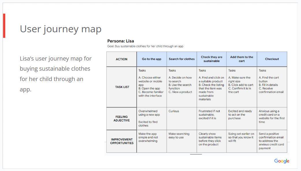
Subsequently, I created personas and user journey maps for these parents, which helped build empathy with my target users. This gave me clear problem statements that my app needed to address.
To further inform the research process, I began competitive audits on existing children's clothing apps and general clothing reselling platforms. This allowed me to gain insights into successful strategies and areas for improvement in similar products, as well as identify common UI techniques prevalent in shopping apps, such as card layouts for products.
Wireframes
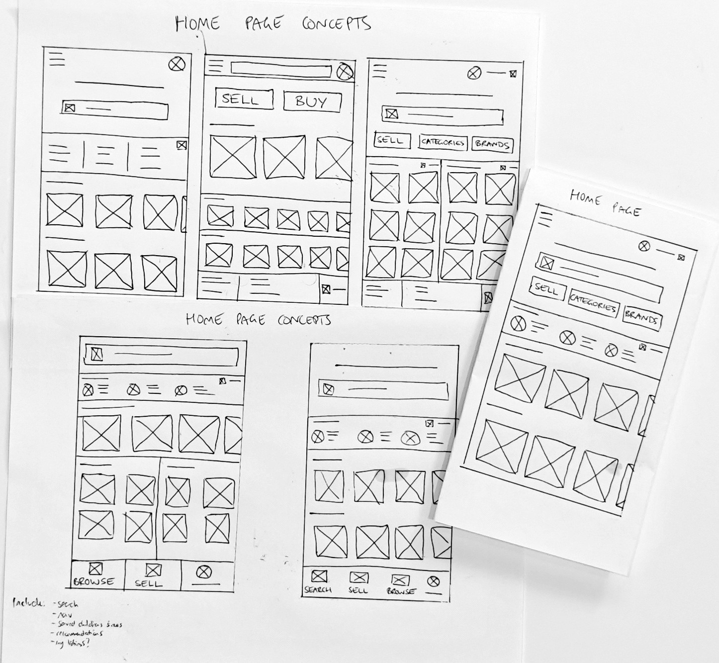
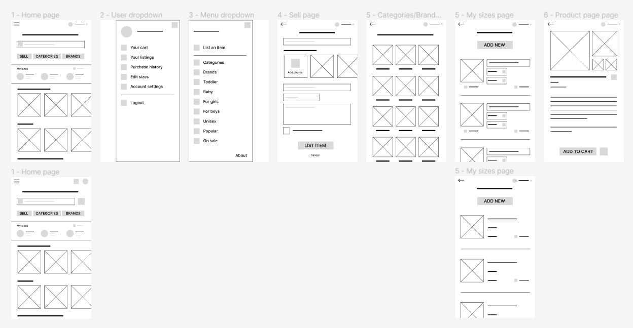
Following that, I proceeded to create wireframes for the app. Ensuring thorough exploration, I sketched five different versions of the same screen, providing a diverse set of concepts for evaluation and iteration. I then translated these paper wireframes into digital wireframes using Figma. This allowed room for minor adjustments to the app's layout and placement of text areas. The digital wireframes began to uncover significant design challenges, particularly concerning navigation, which needed careful consideration.
Prototypes
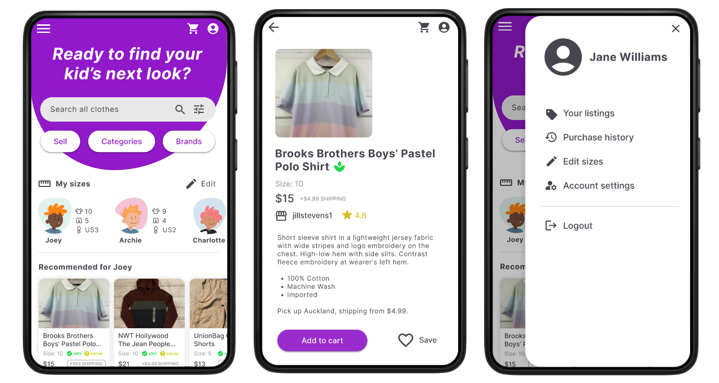
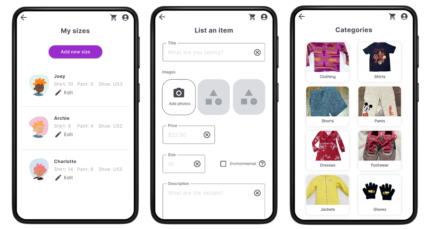
I transformed the wireframes into low-fidelity prototypes using Figma. These prototypes depicted various user flows for fundamental interactions, such as listing an item for sale, browsing items, adjusting children's sizes, and navigating menus. Usability testing was then conducted on these prototypes (see the next section on testing).
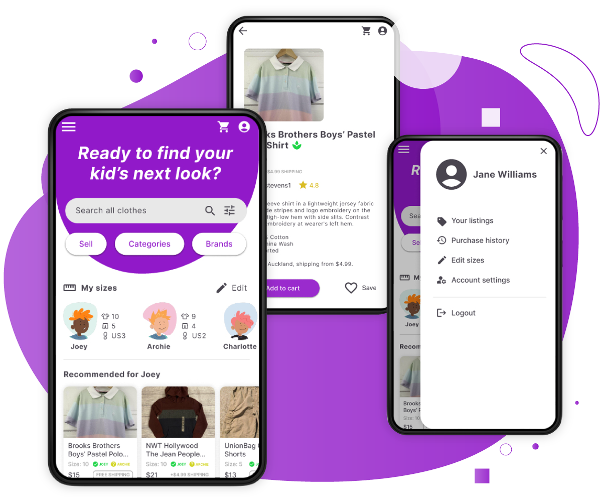
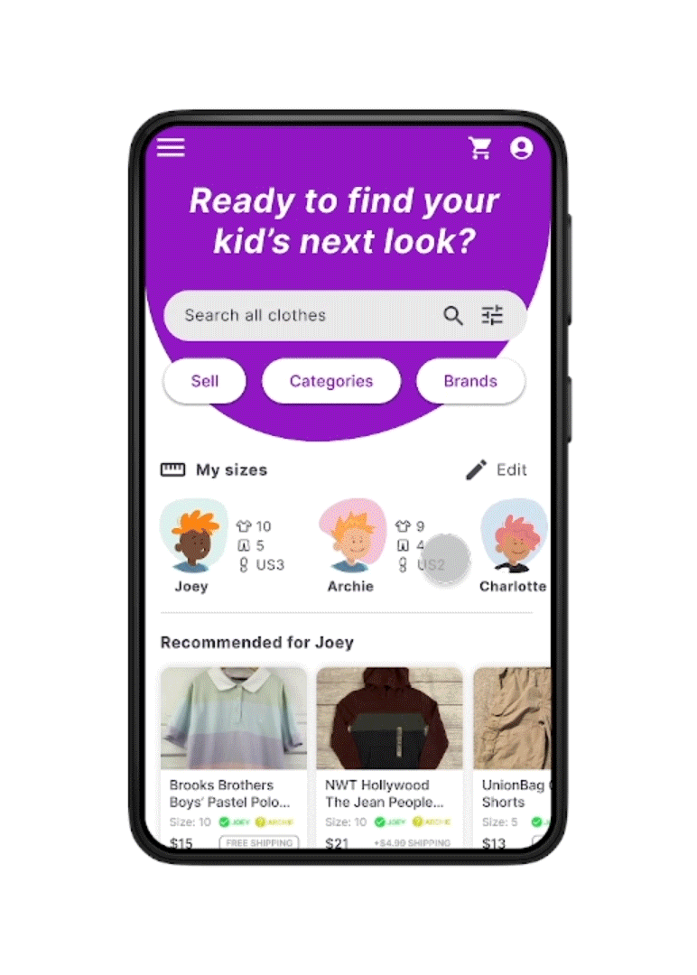
Following the iterations from the usability testing on the low-fidelity prototypes, I proceeded to develop the high-fidelity mockups and prototypes. These encompassed detailed colours, graphics, and motion to provide a comprehensive visualisation of the app's design.
Following the iterations from the usability testing on the low-fidelity prototypes, I proceeded to develop the high-fidelity mockups and prototypes. These encompassed detailed colours, graphics, and motion to provide a comprehensive visualisation of the app's design.
Usability Testing
Users underwent usability testing using the basic functionality of the low-fidelity prototype to identify and address any issues in the initial design structure of the app. Five key issues were discovered, including frustration over the cart not always being visible on the screen and some users searching for filtering options before submitting their search query. These issues were addressed through iterations in the low-fidelity prototypes.

Accessibility
Throughout this project, accessibility considerations remained a top priority. For instance, I incorporated an option to disable all motion and animation, ensuring a more accessible experience for users navigating the app. Additionally, I addressed colour and contrast concerns by implementing three colour modes for users to choose from. I also integrated a native option to support text resizing.
To explore my personas, journey maps, prototypes, and more, please refer to my case study presentation.
To explore my personas, journey maps, prototypes, and more, please refer to my case study presentation.