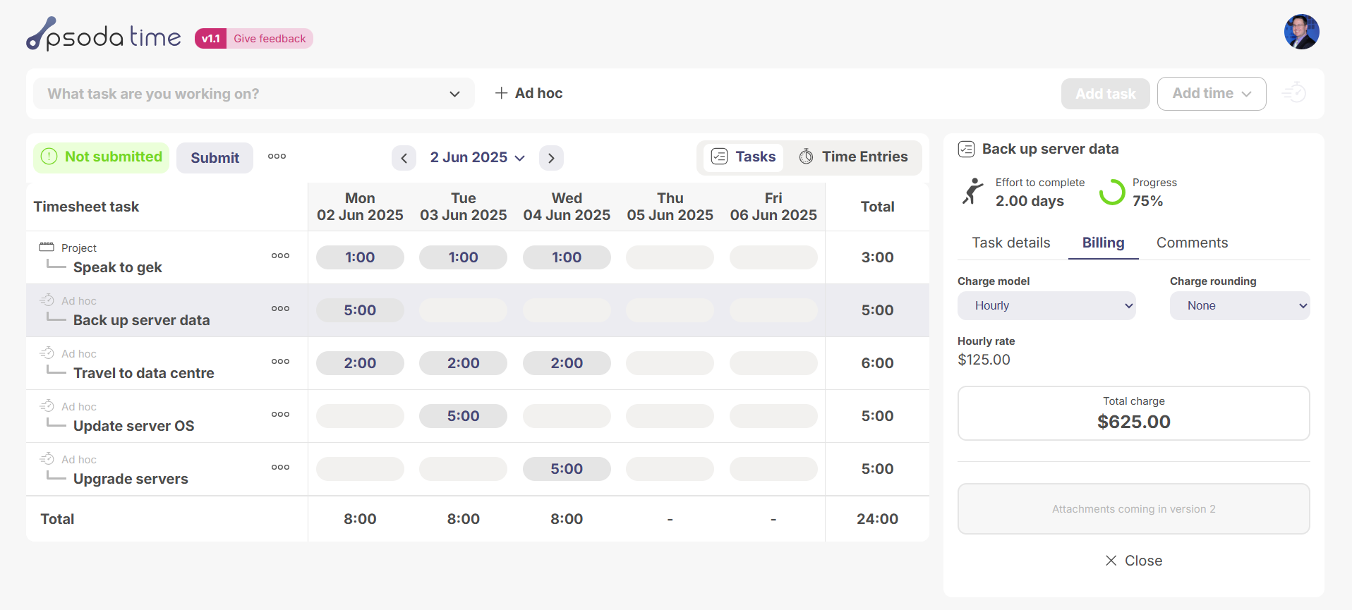
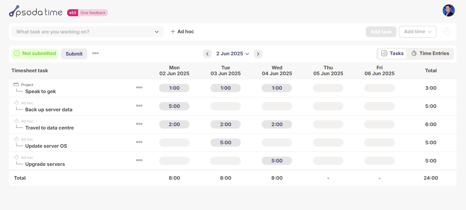
Psoda has powerful portfolio project management features built into a specialised interface, making it great for handling complex resourcing and scheduling. This allows users to log time against specific tasks, helping teams track projects accurately. However, it also meant that everyday timesheet-only users had to navigate Psoda’s full, technical interface just to enter timesheet data. That’s where this PsodaTime project comes in—a simple, standalone timesheet app designed to make it quick and easy for users to enter their hours without the large interface.
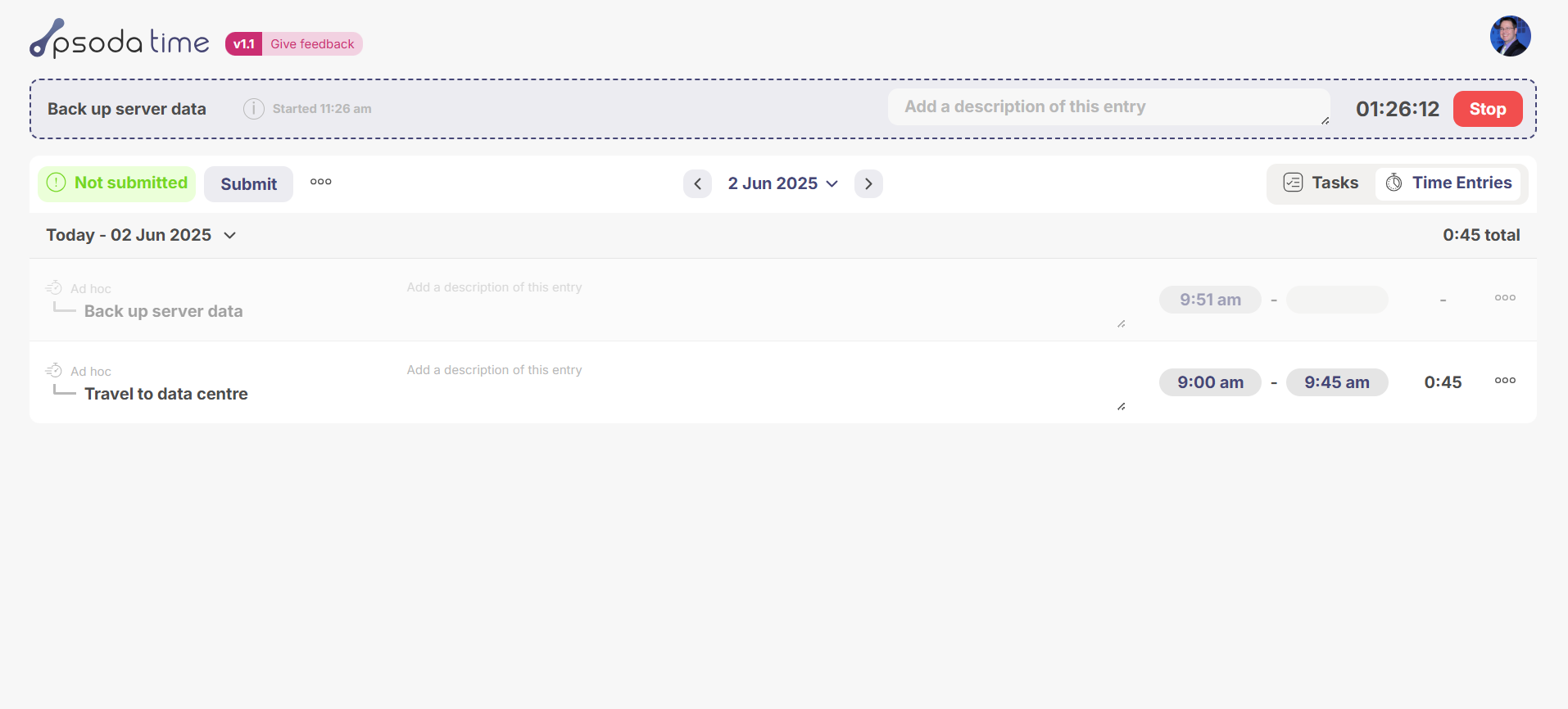
I was responsible for both designing and developing the application. The goal was to make it really easy to use and fast for users to enter their data, while still integrating with Psoda’s deeper functionality. It also required new, timesheet-specific features—like a built-in stopwatch timer to track tasks in real-time.
I was responsible for both designing and developing the application. The goal was to make it really easy to use and fast for users to enter their data, while still integrating with Psoda’s deeper functionality. It also required new, timesheet-specific features—like a built-in stopwatch timer to track tasks in real-time.
User Research
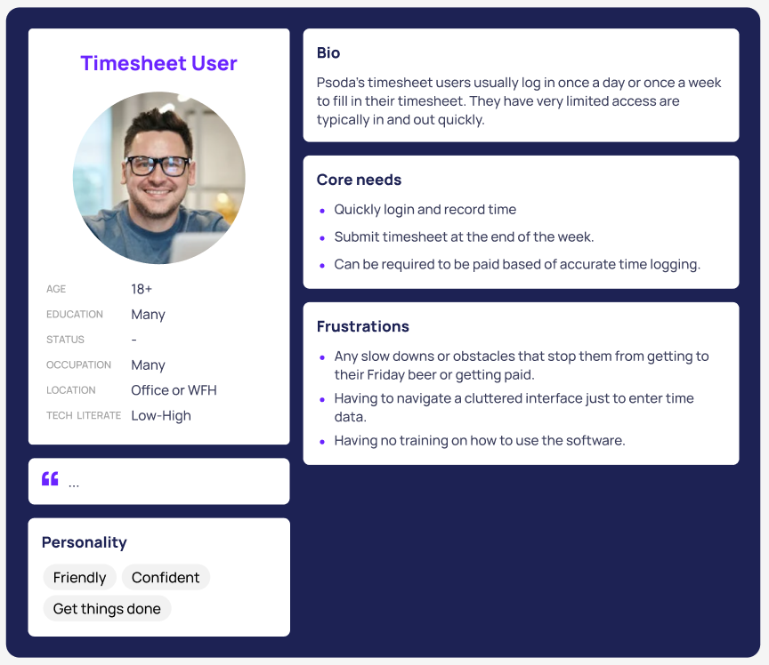
This app was specifically designed for our timesheet-only users, which meant we could leverage the existing user personas we had previously developed. These personas outlined how different users interacted with the timesheet functionality and highlighted their core goals. From this, two key requirements emerged for the project: the app needed to be easy to use and fast for entering data.
I conducted competitive analysis on other timesheeting platforms to understand the different approaches to entering data quickly, as well as any other useful interface techniques that could improve the user experience.
I conducted competitive analysis on other timesheeting platforms to understand the different approaches to entering data quickly, as well as any other useful interface techniques that could improve the user experience.
Prototypes
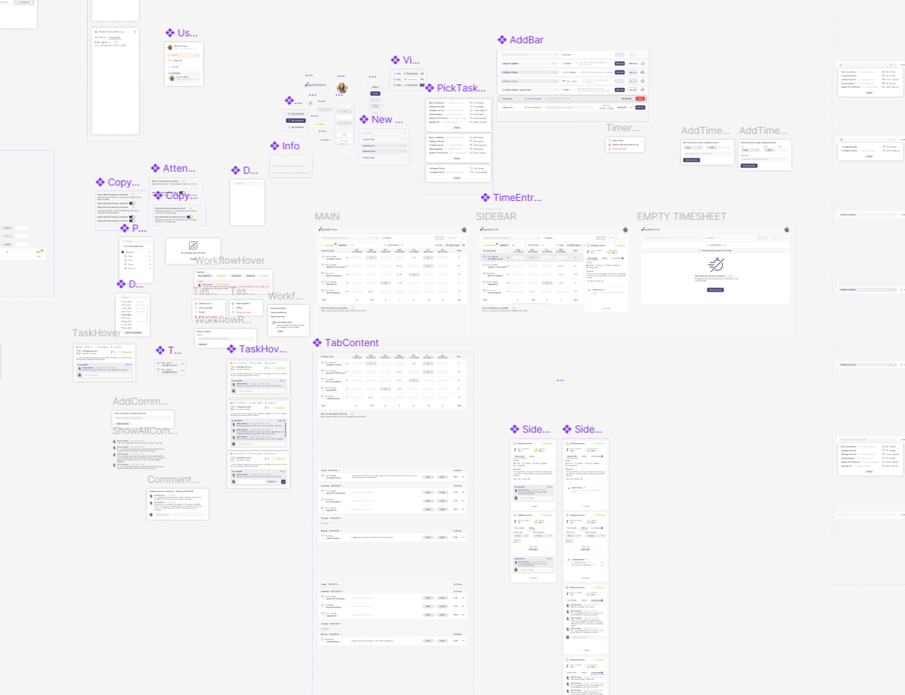
I used Figma to create both low-fidelity and high-fidelity prototypes that showed the app’s full functionality. It was critical these prototypes were built quickly in Figma so that it would allow us to start gathering user feedback early on, particularly around layout and the data entry experience.
Usability Testing
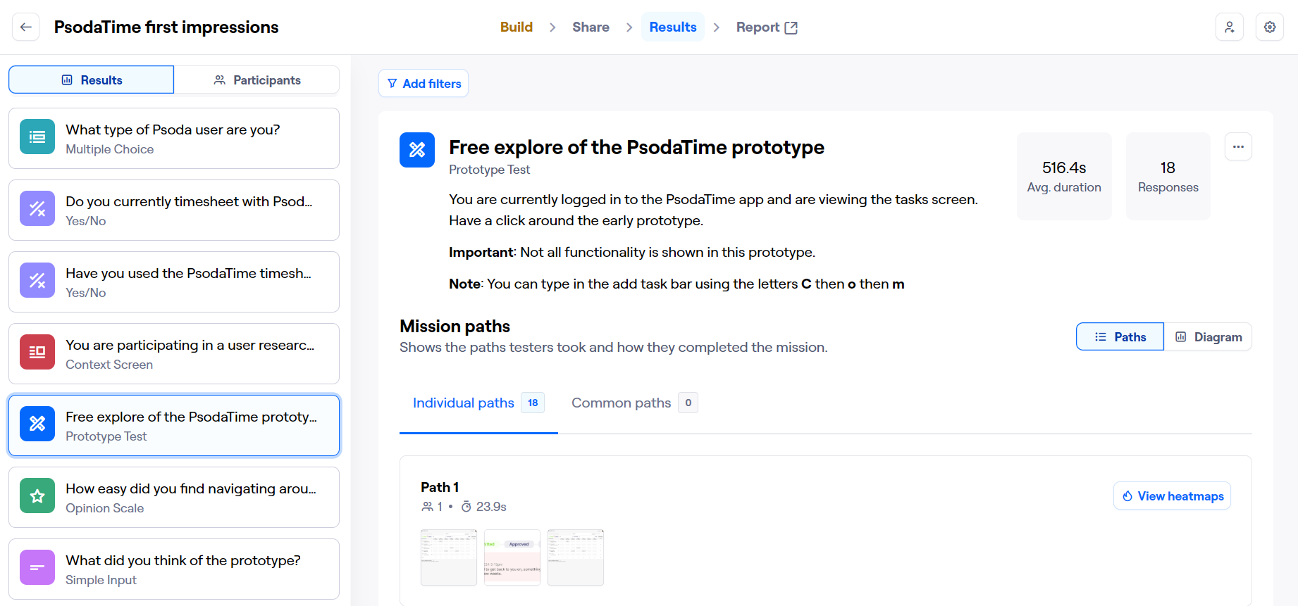
Usability testing was a key part of the process—from the early low-fidelity prototypes all the way through to post-release. I used Maze to conduct early testing on the intital layout and functionality of the app. As the core requirements were easy to use and quick to end data, we continuously tested each interactive prototype, gathering feedback and making iterative improvements based on the results.
Accessibility
Accessibility is always a priority in my design process. For this project, a key consideration was ensuring the app could be fully navigated and used with a keyboard only, allowing users to enter time using only keystrokes. Other considerations I made during design were strong colour contrast, avoiding colour-only indicators, ensuring text scaled appropriately, and more.