After reviewing our UX/UI processes at Psoda, the team concluded that we needed a design system to serve as our single source of truth for all UI elements. This system would ensure consistency in assets and colours across the tool, centralise information on icons, and help with the creation of quick mockups with pre-designed components.
We decided to use Figma to house our design system. Figma offers distinct advantages, including dev mode, reusable components, interactivity, and more.
I started building the design system by researching and documenting all the interactive assets, iconography, colours, typography, and other elements that Psoda currently uses. This provided a blueprint for the initial version of the design system.
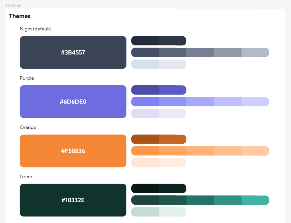
Theme Colours
Psoda's interface colour scheme is heavily dependent on the user's selected theme, with each theme featuring a distinct colour palette. It was crucial to incorporate every shade of each colour scheme into the design system for consistent use throughout Psoda. Team members can now quickly select the main theme colour or interrogate the varying shades of the other colours.
Iconography
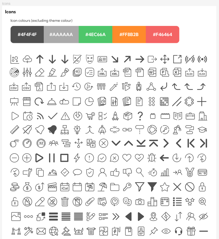
Psoda uses a lot of icons! I originally designed the complete icon set for Psoda (over 200 icons) in Adobe Illustrator. However, team members often struggled with visibility of all the icons and had to ask me to find a specific icon. To address this, I created a dedicated page in the design system for icons. This page shows the team the available colours for each icon and specifies which icon to use. Additionally, each icon includes its associated code syntax, allowing developers to quickly integrate icons into their work.
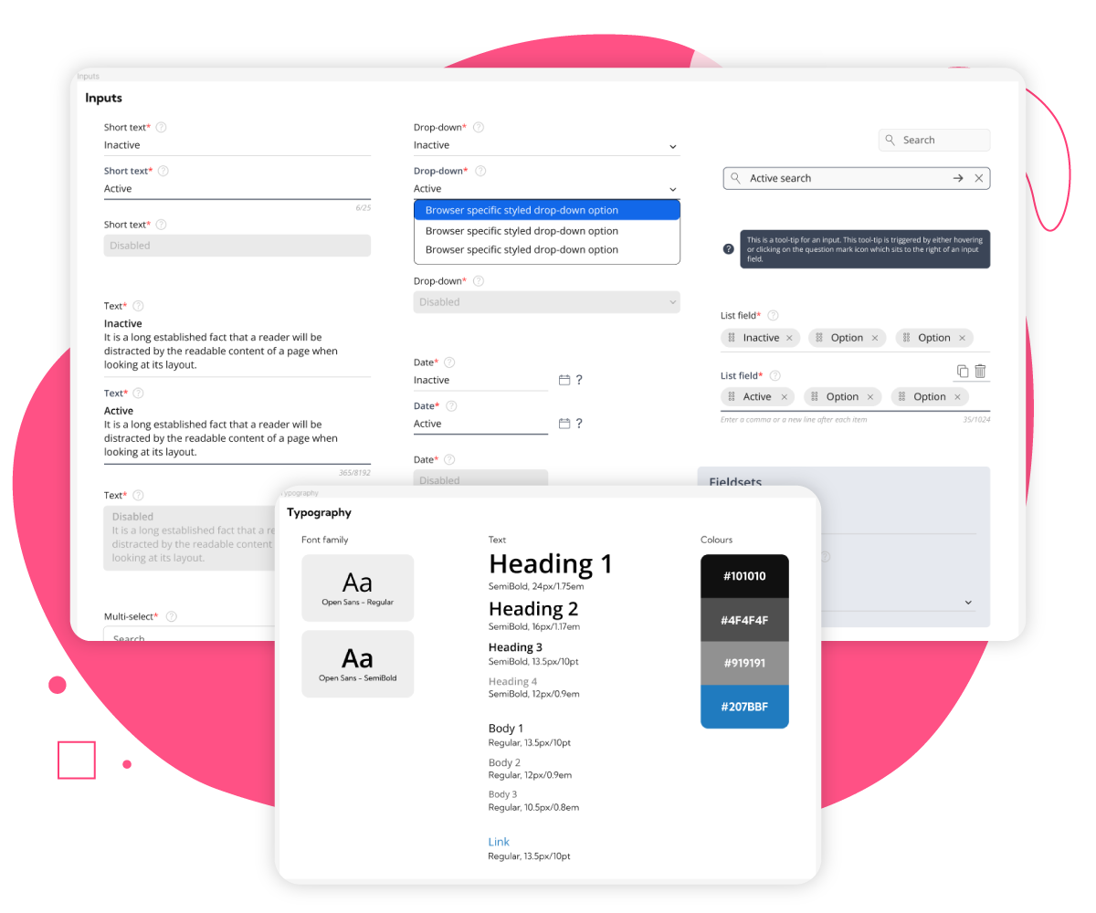
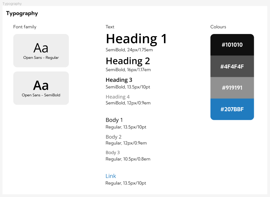
Typography
Typography is crucial for Psoda, given its heavy emphasis on data presentation. In the design system, I created a hierarchical view of typography, ranging from headers to small body text. Each element is detailed with its size, font family, and font weight. Additionally, typography colours are incorporated on this page to ensure text consistency throughout Psoda.
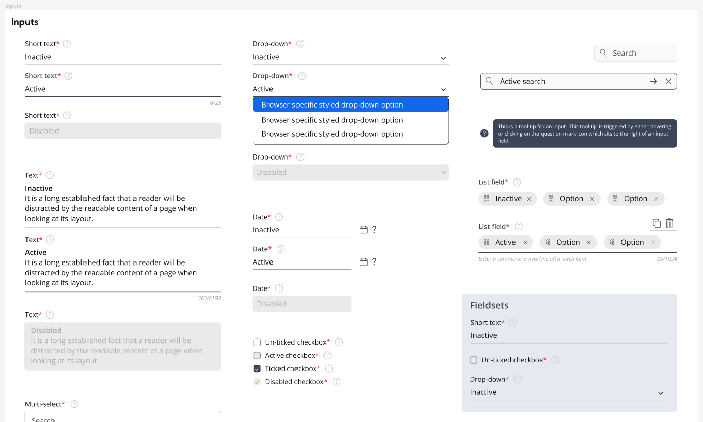
Input Elements
Psoda's core input functionality relies on popups containing various input fields. When redesigning Psoda, I initially created these stylised input fields, which include different states like inactive, active, and disabled. It was important to illustrate these states in the design system for the team, but also to have them as Figma components with state-based options for easy use in future prototypes.
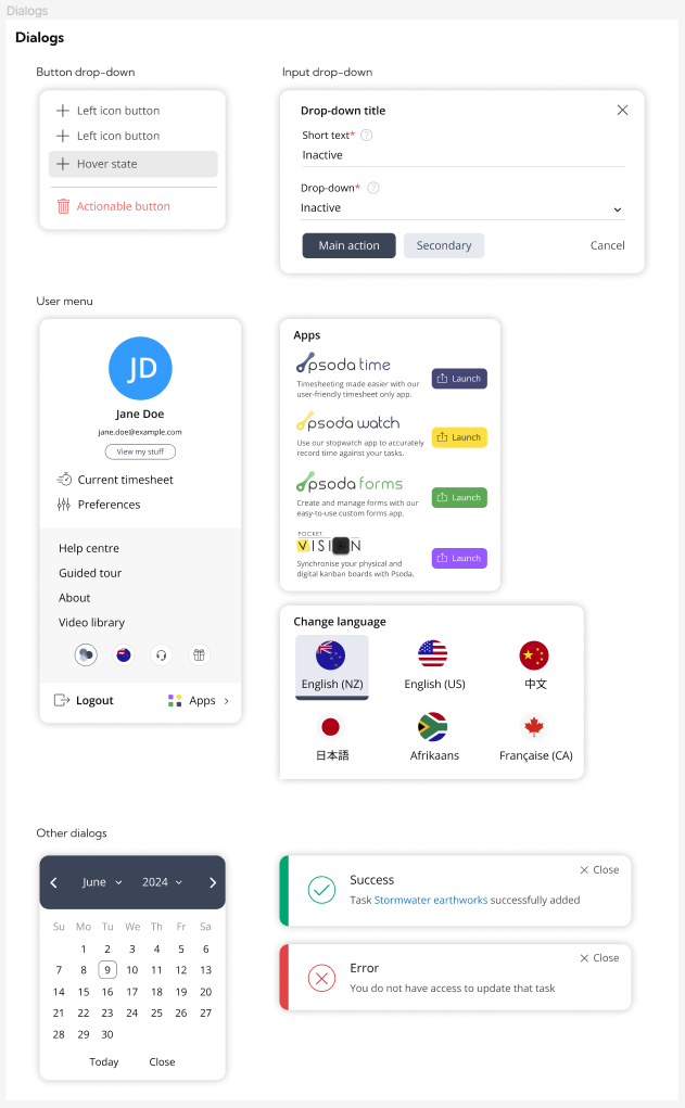
Dialogs
Psoda uses numerous overlay dialogs to help users access buttons, input information, and customise the tool. Some dialogs were inconsistent with others, so I created a page in the design system outlining the core structure of our dialogs. The development team has since used this page to update and standardise all dialogs in Psoda, ensuring consistency.
I will continue to refine and enhance our design system over time, adding more documentation, code syntax, and some of the more obscure assets currently used in Psoda. The design system has been successfully adopted by the team and has already provided significant benefits, particularly for the development team.