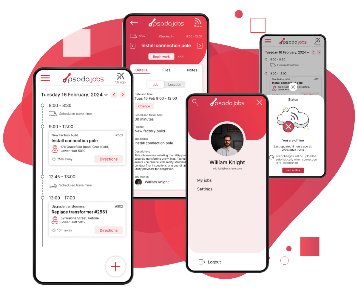
The goal for this new Psoda app was to create a centralised data hub, allowing project managers to plan and resource projects in Psoda (a project portfolio management tool) and seamlessly share that information with technicians and project managers through the new PsodaJobs app.
My role in this project was to lead the UX research and design of this offline-capable mobile app.
My role in this project was to lead the UX research and design of this offline-capable mobile app.
User Research
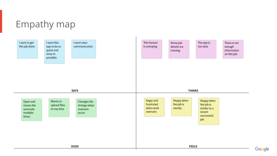
I started by developing a user persona for our primary user, the lead technician, who plays a crucial role in relaying information from the app to their team in the field as well as updating the job status and any information in the app. After establishing this persona, I conducted user journey mapping to identify key daily goals they aim to achieve. To better understand their experience, I developed an empathy map to explore their emotions while using the app and performing their tasks. With these insights, I then crafted several user flows to outline the app's basic user flow functionality.
Next, I conducted a competitor analysis on apps such as Simpro and Fergus to identify effective key features and designs. I also researched areas for improvement in their products based on their customer feedback and reviews.
Next, I conducted a competitor analysis on apps such as Simpro and Fergus to identify effective key features and designs. I also researched areas for improvement in their products based on their customer feedback and reviews.
Wireframes
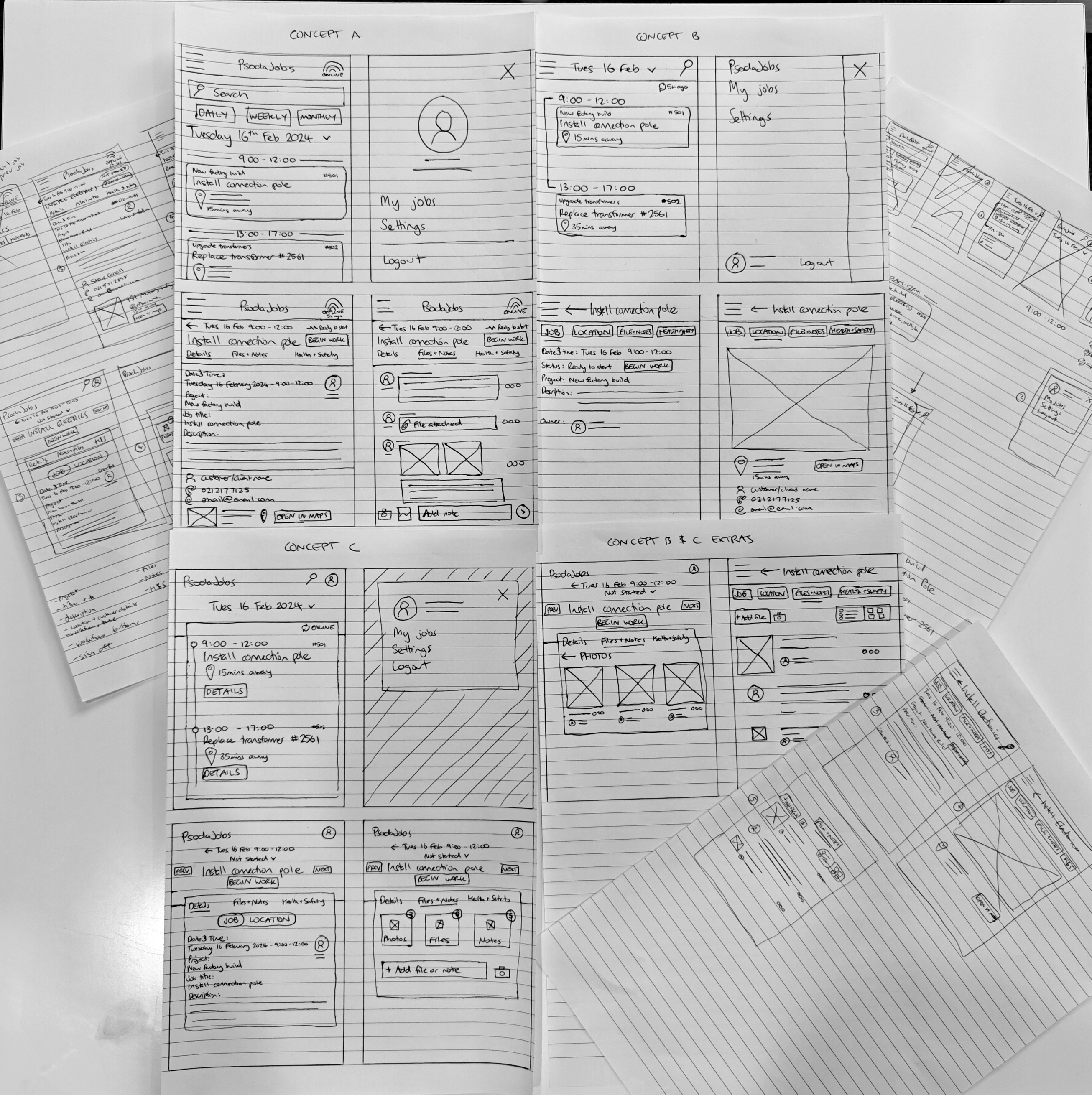
I began by sketching wireframes with the aim to create a bunch of different variations of the main screens. This would then allow me to conduct usability testing on each of the different variations to identify which aspects of the design users find useful and which ones they don't. By challenging myself to create various versions of the same screen, I explored different ways to present information, leading to some unique and modern designs.
Prototypes
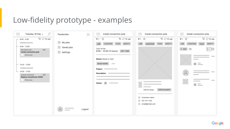
I used Figma to convert the paper wireframes into digital ones, enabling me to create multiple low-fidelity prototypes of the core screens. These prototypes were then shared with the project stakeholders, who conducted the first round of usability testing (see the next section on testing).
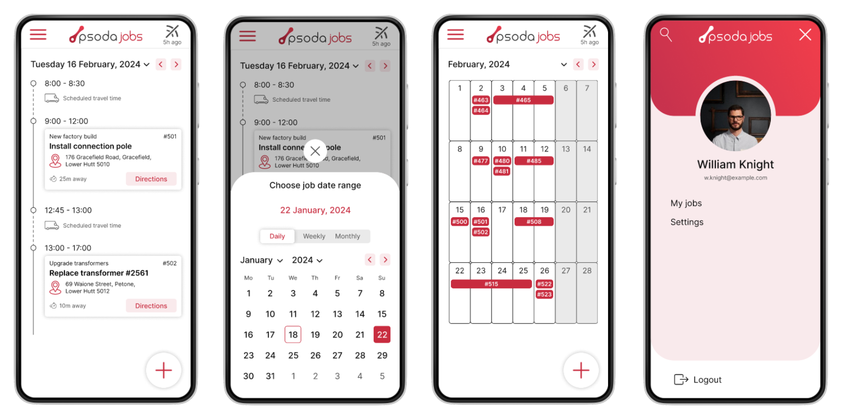
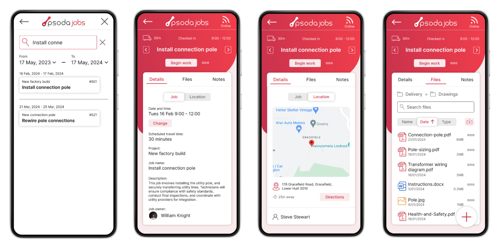
After the first round of testing, I combined elements from each variation based on the feedback received. In this updated prototype, I added more screens to complete the basic interactions for all the core functionality. This low-fidelity prototype was tested again, and the feedback was incorporated into the high-fidelity designs, where color, graphics, and motion were added to bring the app to life.
After the first round of testing, I combined elements from each variation based on the feedback received. In this updated prototype, I added more screens to complete the basic interactions for all the core functionality. This low-fidelity prototype was tested again, and the feedback was incorporated into the high-fidelity designs, where color, graphics, and motion were added to bring the app to life.
Usability Testing
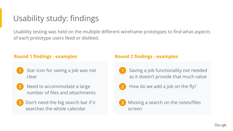
Project stakeholders conducted multiple rounds of usability testing on both the low-fidelity and high-fidelity prototypes. Key feedback from the early prototypes included the need to accommodate a large number of files and attachments for each job, removing the saved jobs feature, reducing the prominence of the search bar, making several icon changes, and more. This feedback played a crucial role in shaping the high-fidelity prototypes that followed.
Accessibility
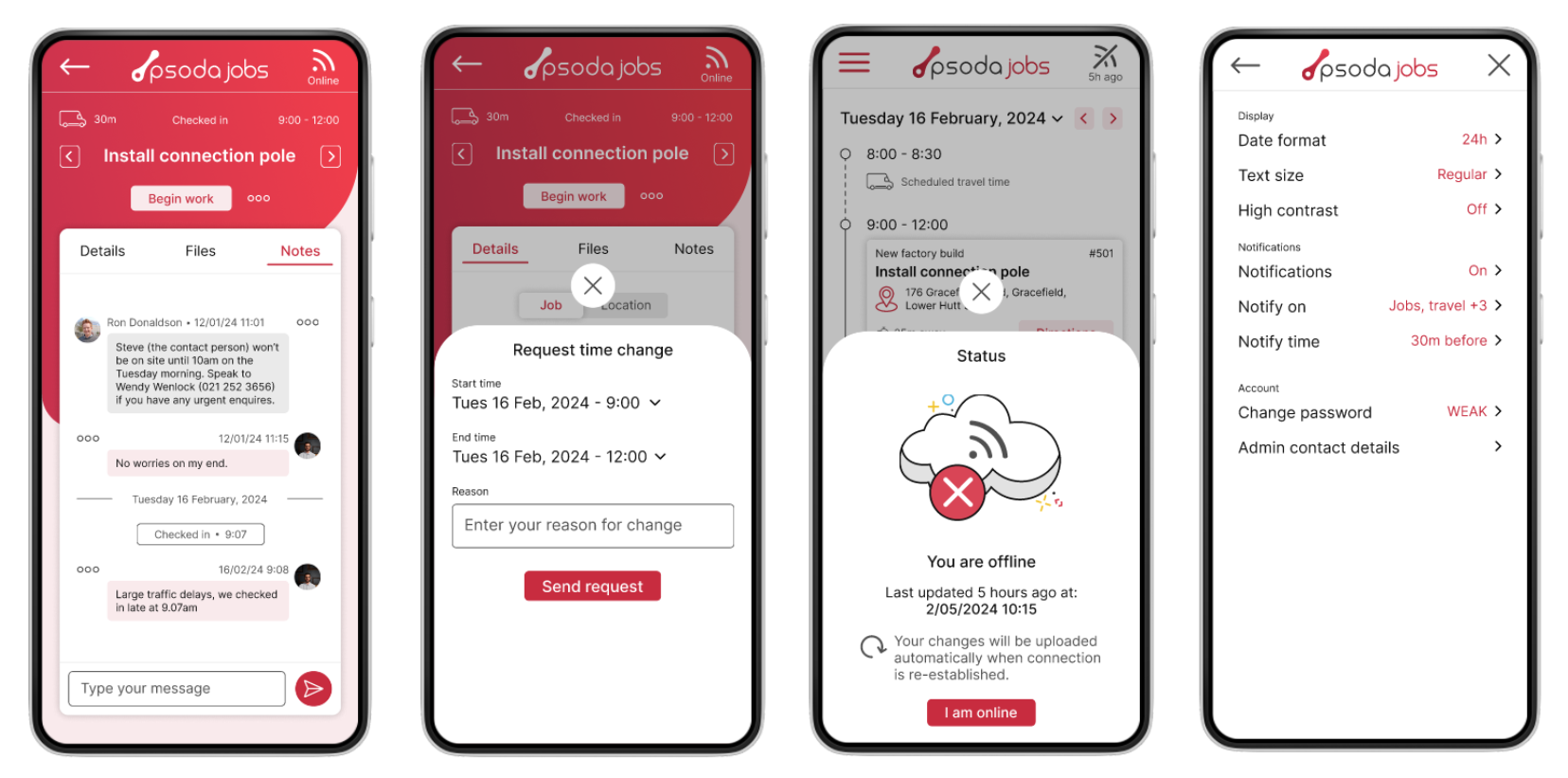
Accessibility is always at the forefront of my designs from the outset. For this project, key accessibility features were incorporated into the settings page, including options for adjusting text size and enabling high-contrast modes for users with visual impairments. The adjustable text size also benefited technicians working in the field with gloves, as it increased button sizes for easier interaction. Additionally, an option to disable animations was included, as the app used motion on screen transitions.
To explore my personas, journey maps, prototypes, and more, please refer to my case study presentation.
To explore my personas, journey maps, prototypes, and more, please refer to my case study presentation.

